Tiny Rash Acts: The Watercolours of Amber Wilson
Watercolour often calls to mind stale landscapes. Francis McWhannell explores the work of an Auckland artist who is doing exceptional things with the medium.
Watercolour often calls to mind stale landscapes. Francis McWhannell explores the work of an Auckland artist who is doing exceptional things with the medium.
I first encountered the work of Amber Wilson in 2013 at Porous Moonlight, a painting show at the unassuming Papakura Art Gallery, curated by Wilson’s friend (and then studio-mate) Imogen Taylor. Her works, all oils, hung alongside paintings by an unlikely, but totally satisfying, assortment of living and dead artists, including Frances Hodgkins, Denys Watkins, Nicola Farquhar, and Claudia Jowitt. In a show of confident painters, Wilson stood out for her superb technique, as well as the quiet sense of delight that her works conveyed. Here was a painter who knew her medium intimately and loved to play with it. What I did not know then, and would not discover until earlier this year, was that oil painting was just one part of Wilson’s practice. She was also a watercolourist of great ability; she is, I think, one of our best.
Amber Wilson, Sashaying Meissen, 2011. Courtesy of the artist and Anna Miles Gallery.
To anyone who has seen her dazzlingly precise watercolours, it will come as no surprise to learn that Wilson initially intended to become a jeweller. Having enrolled at Unitec Institute of Technology, however, she found herself increasingly attracted to the painting department. It offered more interesting reading material and a more robust studio culture. It didn’t hurt that the painters had good parties. From the first, Wilson’s work was underpinned by a rigorous drawing practice. The sophistication of her watercolours points to the extensive experimentation and planning that lie behind them, though you will hunt in vain for traces of preparatory pencil-work. The paintings also convey the artist’s great enthusiasm for the decorative arts. Art and craft are intimately intertwined in her work.
Amber Wilson, Willendorf Inlay, 2011. Courtesy of the artist and Anna Miles Gallery.
Wilson’s influences are many and varied. She likens her research process to casting fishing lines back into the past to hook an assortment of references. The very titles of her watercolours betray her deep interest in, and knowledge of, the long histories of art and design. For instance, Sashaying Meissen (2011) alludes to the often extravagant polychrome porcelain manufactured in Meissen, Germany, from the early 18th century: Willendorf Inlay (2011) to the famous Woman of Willendorf, a paleolithic ‘Venus’ unearthed in Austria in 1908; and In a flurry with H. Moore (2011) to the 20th-century British sculptor Henry Moore.
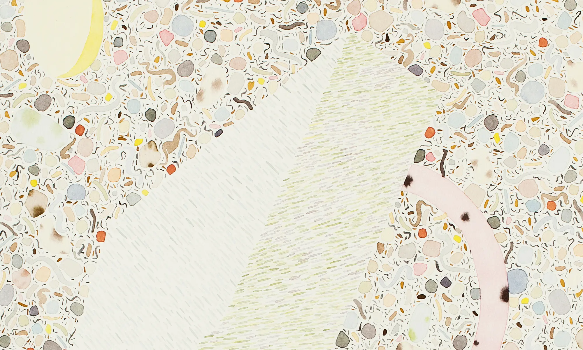
Amber Wilson, Arc de figurine, 2011. Courtesy of the artist and Anna Miles Gallery.
Wilson’s earlier watercolours hint at her fondness for postmodern design, and especially for the fanciful furniture of Memphis, a group of Italian designers and architects who favoured the use of plastic laminates and other synthetic materials. Works like Formica Allover (2009) and Arc de figurine (2011) are extreme in their intricacy, not merely echoing, but outdoing the profusion of colours and patterns found in Memphis pieces. The panoply, however, is always carefully ordered. There is nothing haphazard about even the busiest of Wilson’s works. They remain rhythmic and harmonious, never descending into cacophony. That they are executed in watercolour – a notoriously unforgiving medium, which does not allow for correction – testifies to an almost superhuman ability to coordinate complexity on the part of the artist.
Amber Wilson, Free fall geometry, 2015. Courtesy of the artist and Anna Miles Gallery.
Wilson’s works have long been characterised by ambiguous forms. Heavily indebted to the sculpture of modernist artists like Barbara Hepworth, Constantin Brancusi, and of course Moore, the forms blur the boundaries between the figurative and the abstract, the biological and the geological, the natural and the artificial, the ancient and the futuristic. Earlier works, such as The Danish Destroyer (2009) and Willendorf Inlay, have a humorous, sci-fi quality to them, very much in keeping with the whimsy of much postmodern design. Later works, such as Free fall geometry (2015) and Granite to the core (2015), show a simplification of shape and colour that puts them more in line with the elegance of mid-century modern design.
Amber Wilson, Free fall geometry (detail), 2015. Courtesy of the artist and Anna Miles Gallery.
The artist’s latest series of watercolours, exhibited at Anna Miles Gallery as Looming from the margins, is still more restrained. This is a consequence not only of Wilson’s longstanding practice of reworking and refining her own systems of image-making, but also of the move from a rented studio with more stable light conditions to a room in the her home with direct, and changing, light. Shadows now fall on her work in markedly new ways, and this has driven Wilson to seek to translate her sensations into images. She notes, “It became a real point of interest for me to derive forms from a more intangible place than design history.”
Amber Wilson, In which the unbreakable sky, 2016. Courtesy of the artist and Anna Miles Gallery.
Curiously, the shift towards a more sense-based art has coincided with the introduction of seemingly more literal elements. The Looming from the margins works incorporate forms strongly reminiscent of fabric. (The word ‘looming’ quickly acquires a weaving association.) Executed with a precision that threatens to surpass her previous efforts, these fabric-like elements tend to recast the composite bodies long favoured by Wilson as textile patterns. The effect is especially pronounced in works like Menhirs of foam (2016) and In which the unbreakable sky (2016), in which the fabric and composite shapes closely coincide. In such works, it is almost as though the latter has leapt, or been peeled off, the former.
Amber Wilson, Menhirs of foam, 2016. Courtesy of the artist and Anna Miles Gallery.
Previous works, like Formica Allover and Sashaying Meissen, seem to sit outside the realm of direct perception, in terms of both material and scale. They have all the intangibility of the microscopic and cosmic, all the strangeness of theoretically possible but unobservable phenomena. Wilson’s newer works, by contrast, feel grounded in human experience. Their relationship to objects found and made by people is decidedly more pronounced. Thinking of the artist’s eclectic interests, I see in her painted clusters the garnet shards of a piece of Anglo-Saxon cloisonné, the glass tesserae of a Byzantine mosaic. I think, too, of more recent and less exulted agglomerations: the coloured pebbles of an exposed aggregate step, or the glossy candies stocking a supermarket dispenser.
Amber Wilson, Formica Allover, 2009. Courtesy of the artist and Anna Miles Gallery.
The encompassing forms have their own touchstones. Wilson speaks of her particular interest in a sculpture titled Eve (1928) by the British artist and typeface designer Eric Gill. Her Eve bends to draw at the well (2016) makes nominal reference to the work, while echoing its sensual curves. Importantly, Gill is known to have borrowed extensively from ancient Indian sculpture. In adapting a piece that itself depends on adaptation, Wilson acknowledges the lines of influence and affinity that connect artists separated over great stretches of time. The meaning of Wilson’s title becomes unclear. It may suggest a woman collecting water, drawing on the font of human experience, or simply sketching beside a spring.
Amber Wilson, Eve bends to draw at the well, 2016. Courtesy of the artist and Anna Miles Gallery.
Wilson notes that she has also been thinking a great deal about the American abstract artist Ellsworth Kelly, and, indeed, a number of her recent watercolours make use of the sorts of irregular, not-quite-polygonal forms that frequently appear in his work. More important is her interest in the energy that Kelly injected into his shapes. The title of her show Looming from the margins is an oblique reference to the attention paid by Kelly both to the edges of the forms he created (his work has been termed ‘hard-edge painting’), and to the relationship between the forms and the margins of the supports on which they appear. “His work has a way of pushing out to the edges of whatever surface it’s on,” Wilson notes. “You get a sense of things about to burst and a kind of magnetism within the frame.”
Amber Wilson, Looming from the margins, 2016. Courtesy of the artist and Anna Miles Gallery.
An attractive/repulsive tension is very much at play in Wilson’s latest work. Her painting Looming from the margins provides a particularly clear example. The composite body – strongly reminiscent of a Kelly shape – floats on the page, as if repelled by the fabric-like square below and the margins of the page above. At the same time, its internal units are tightly packed, as though drawn to one another. The configuration of the units and of the larger pictorial elements does not seem preordained or fixed. As with so much of Wilson’s work, one gets the impression that the arrangement presented is consistent with a set of external laws but underwritten by coincidence – that one is observing a highly ordered system subtly coloured by happenstance.
Amber Wilson, Looming from the margins (detail), 2015. Courtesy of the artist and Anna Miles Gallery.
I’m talking about a particular work, but I might just as easily be describing Wilson’s process in general: the methodical collection, filtration, and assembly of pictorial elements under chance ambient conditions. Looking at Wilson’s watercolours, scrutinising them, as they demand to be scrutinised, I become acutely aware of the physical performance of their making. I see the artist in my mind’s eye, filling out her carefully composed schema with deft strokes and delicate puddles of paint. She knows how her medium works, how the pigment will migrate to the edges of each jewel-like fragment, creating a crisp, glowing border. Mostly, she maintains strict control, but every so often she runs a risk, allowing one colour to leopard spot into another however it might. It’s a tiny rash act, but it’s the rashness that matters.
Main image: Amber Wilson, Arc de figurine (detail), 2011. Courtesy of the artist and Anna Miles Gallery.
Note: Two of Amber Wilson’s recent watercolours are included in Painting Programme (Prog) at Pah Homestead, TSB Bank Wallace Arts Centre.