Burying Architecture: A Review of Future Islands
Can architecture survive the burdens of exhibition making?
Can architecture survive the burdens of exhibition making?
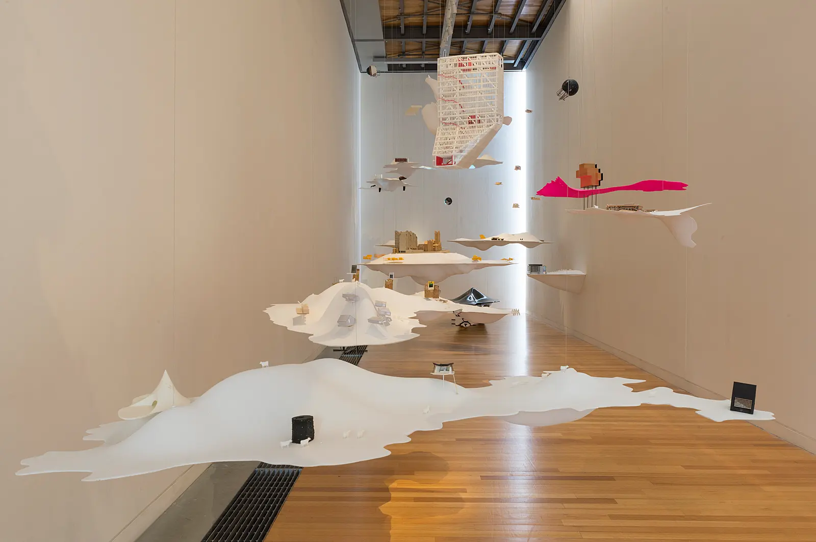
A large mobile of smooth white lumps dotted with tiny cows and scattered structures, ranging from conventional scale models of buildings to ambiguous spheres hangs in a skinny double-height space. Everything is floating. Everything is floating except for a single black lump that sits on the ground. This grounded lump, or bench, is also the only acceptable form of physical contact as a viewer. Sitting on the bench, one may read the accompanying publication and learn that what they are sitting on is in fact “highly polished black carbon fibre that is recycled waste left over from the manufacture of Boeing 787s”.
Future Islands, New Zealand’s exhibition at the 2016 Venice Architecture Biennale, is on public display for the first time in Wellington at the Adam Art Gallery, after a stint at Auckland’s Objectspace. A creative team of eleven, curated 50 projects by architecture firms, students, and individuals, consisting of over 100 models across 22 floating ‘islands’, providing an interesting conversation around architectural representation within gallery spaces. It contains models of buildings that currently exist in New Zealand, and also speculative, unbuilt projects. It is what New Zealand architects wanted to show the world of New Zealand architecture.
As an experience, Future Islands, is quite delightful. There are projected videos and lights, the islands hang at different levels, the structures are colourful, and different in shape and material. Future Islands acts as a good example of what both the art and architecture fields can gain from each other – a bit of playfulness and a bit of grounding. As a further nod to the melding of the two fields, the display also uses its own space well, making the most the voluminous heights of the Athfield-designed Adam.
Future Islands (installation view) on view at Adam Art Gallery Te Pātaka Toi, 14 October – 17 December 2017. Photo: Shaun Matthews
From first glance – either from above or below, the Adam allows for both – it is clear that this is not a conventional show of architecture.
From first glance – either from above or below, the Adam allows for both – it is clear that this is not a conventional show of architecture. Conventionally, architecture is represented as a static, often singular, iconic object. Instead there is no single point of focus, a completely non-hierarchical scattering. Delving into the accompanying text, it’s clear that the creative directors also did not want that, instead desiring to “raise some questions”, to pay dues to “architecture’s obligation to be speculative” and “invent different ways of living, to make new things possible”.
In some ways, the exhibition succeeds in this. The floating bases remove an assumed eye-level. There are things to be discovered by walking underneath them, around them, above them. It pushes the body to move, rather than just accommodating the body. The custom-made bench allows for physical contact with the exhibit, albeit a single one. A definite case against the myth of the lone genius architect, it presents architecture as a collection of projects designed by many people. Not only are there 50 different projects, but for most of these, each has its own group of designers behind it.
There is also a refreshing lack of human figures – I found only four – and instead there are 413 cows, the average size of a dairy herd in New Zealand. It’s interesting that this comes from a figure of animal commodification, as the cows remind us there is more to our world than just people. This is likely a generous reading of the cows, to see them as inhabitants of a post-anthropocene world where ex-farm cows roam freely among buildings that hold no value to them. The cows could also be nothing more than an easy recognition of New Zealand’s international dairy-centric stereotype without any real message behind it – there were also plans to make the islands themselves out of milk powder, abandoned for technical reasons.
Future Islands (installation view) on view at Adam Art Gallery Te Pātaka Toi, 14 October – 17 December 2017. Photo: Shaun Matthews.
But there are still conventions that Future Islands can’t help but play to. The most noticeable is the very small scale of the models on the islands, many able to be held in the palm of your hand. While the wide collaborative effort dispels a single genius architect, there is still something inherently top-down and distant to the scale of the buildings. While there are practical benefits to their size – more projects and contributors, touring practicalities – one can’t help feeling somewhat god-like walking around these tiny tiny buildings. Not the work of one architect god, but maybe a group of them. The smallness of the models also allows a lot of room to hide, and with this, a guilty suspicion that this was intentional. It’s a well-known trick of architecture school: make your weakest images the smallest. I saw at least one building that could be called ‘corporate’, ‘boring’, or even ‘ugly’, but the size makes it difficult to notice. Maybe this was actually a very clever decision?
The exhibit is also loosely inspired by Italo Calvino’s Invisible Cities, which was published in 1972. You could say that is this great! Incorporating another creative angle – that of a novel – into architecture. However, Invisible Cities is like what Grey’s Anatomy or Scrubs is to medicine. Only much less people have read Invisible Cities. The other novel that the exhibit was inspired by is Utopia by Thomas More, published in 1516, which has been read by even fewer people. These books are neither original or widely understood references. The art gallery, visual art, and architecture are already exclusive in themselves, and all these ‘inspirations’ do is make the exhibition further exclusive.
What is being hidden by this shrinking and vacuuming?
Future Islands (installation view) on view at Adam Art Gallery Te Pātaka Toi, 14 October – 17 December 2017. Photo: Shaun Matthews.
It’s also interesting that the inspirations have little to do with New Zealand, while the exhibit is intended as New Zealand’s show and tell to the world. This international context forces a harsher critique by the viewer. As one walks around, you see what an international audience has also seen. It was only New Zealand’s second time at the Biennale, and the original audience was likely to be looking for difference and voice, rather than yet another take on Calvino, which can already be found in university-level projects anywhere in the world. While all the projects are by New Zealand designers, they are again, so very small, and removed from their site context. This disadvantages many of the buildings that are already small at 1:1, and that have strengths in their thoughtful treatment of site and careful detailing. What is being hidden by this shrinking and vacuuming?
It is a safe representation of New Zealand architecture. It has all the coolness that is impressive in exhibits: white, suspended languid forms and scatterings of things on top of them, a dash of projection here and there, and the backing up of a handful of community and post-disaster projects in the catalogue and a pseudo down-to-earth collaboration with a boat making factory. With all these dressings, one can’t help but ask if New Zealand was too scared to show a heartier, bottom-up presentation of its architecture, and hid behind the display version instead.
I want to be excited and proud of New Zealand’s architecture, and from that position, the lasting impression was mixed. I enjoyed the ways that it did transgress convention: forcing movement of the body, its playfulness is important and could inspire someone just getting into architecture to pursue it. And yet perhaps, among all these playful and exciting tropes of exhibition making, the architecture itself became the least impressive part.
Future Islands: The New Zealand Exhibition at the 2016 Venice Architecture BiennaleAdam Art Gallery Te Pātaka Toi14 October 2017 – 17 December 2017All images courtesy of Adam Art Gallery Te Pātaka Toi