Two Perspectives on 'New Perspectives'
Critics Francis McWhannell and Lana Lopesi discuss a multifaceted exhibition showcasing some of Aotearoa’s most exciting new talent.
Critics Francis McWhannell and Lana Lopesi discuss a multifaceted exhibition showcasing some of Aotearoa’s most exciting new talent.
Artspace’s current exhibition, New Perspectives, features the work of more than 20 artists whose work has begun to make ripples in the local scene. Produced in collaboration with Berlin-based New Zealand artist Simon Denny, the show encompasses an impressive range of material, including eye-wateringly fine paper-based works by Motoko Kikkawa, visceral poems by Owen Connors (printed intransigently in black on black), and dollar coins faked by Matilda Fraser. It’s an ambitious exhibition, and essential viewing for all Aucklanders with an interest in art. Francis McWhannell and Lana Lopesi sat down to share some of their thoughts.
*Francis McWhannell: I suppose it’s sensible to start with the physical beginning of New Perspectives: the downstairs entranceway in the building that houses Artspace, where Huni Mancini’s ‘mood board’ work, Taʻovala (2016), is displayed, and the stairwell area occupied by Quishile Charan’s installation, Salty Tears and Sugarcane Fields (2016). I thought those two works related to one another really interestingly. Both to some extent explore multiple identities, colliding identities, and the negotiation of identities, though their approaches immediately appear distinct.
Quishile’s work is grounded in traditional practices: fabric dyeing with haldi (turmeric) and mud, printing that clearly makes reference to masi (Fijian tapa). Huni’s work, by contrast, employs digital collage, and feels much more urban. I also feel as though the works are quite different in temperament. Though that’s perhaps a function of my knowing Quishile and her practice to some extent, and not knowing Huni at all.
Huni Mancini, New Perspectives (installation view), Artspace, 2016. Photograph by Sam Hartnett.
Lana Lopesi: I’ve always thought that Quishile’s work has a strong aesthetic dimension. She has a clear visual language. And I think in a way Huni’s trying to do something similar: to find a visual language to talk about these ideas. Huni uses an ironic fashion aesthetic that was really popular when I going through art school. It’s something I’ve never been aligned to myself, but I was drawn in to the word ‘diaspora’. The title, Taʻovala, is borrowed from the Tongan mat worn round the waist by both men and women, which I read as an approach to something that’s non-gendered. But what I find most interesting is the conscious use of an aesthetic sensibility that connects to the artist’s peers, millennials living in diaspora, while also subtly referring to something of a traditional homeland.
I was really pleased to see the inclusion of text in Quishile’s work. I’ve always felt that it could get mucky being Indo-Fijian and using motifs that are specific to the land of Fiji, and that strongly recall indigenous Fijian culture. Seeing her really claim her identity, and express that trauma of being a descendant of indentured labourers, was really exciting – and powerful.
Quishile Charan, New Perspectives (installation view), Artspace, 2016. Photograph by Sam Hartnett.
FM: What I find interesting about the written component of Quishile’s work is that it is so intensely reflective of the experience of talking to her – about her experiences and about her practice. And I think you’re right; the work gains impact from the text. I’m really curious to see where Quishile might go with the poetic storytelling aspect of her work. I’ve seen her use text in a similar way before. I’m thinking of her publication Fijianx, and also pieces of writing she created for Postcards from Papatoetoe. I guess I’m curious to see whether she might introduce more oral history material into her work, and whether she might incorporate other media – audio or even video – at some point. Of course, the text element here makes complete sense, with the printed words contrasting the printed images. And it also hints at the extensive research I understand Quishile is carrying out into the history of indentured labour in Viti (Fiji). Anyway, I’m curious to see where she might go.
LL: I think it’s a curse, almost, of all works that are so deeply rooted in identity politics – if you can be so crude in the use of that term – and personal stories, but for me there’s always that question of what you give the audience and what you take away. I don’t know the answers.
Quishile Charan, New Perspectives (installation view), Artspace, 2016. Photograph by Sam Hartnett.
FM: In an interesting way, I think that feeds into one of the first works you come to upstairs, in the exhibition proper, Faith Wilson’s installation with her Open Letter to Simon Denny (2016) and its partner video, all that was left was hope (2016). The work seems to be acutely aware of the question of what to give and what to withhold, how much of yourself you can be expected to give – as an artist and as a human, really – and how much it’s kind of important, for your own sake, to hold back. For me, Faith’s work belongs to a group of key works in New Perspectives – works that are exceptionally good in their own right, but that also help to unlock other works in the show. They are almost like hooks that the whole show hangs on. What did you make of Faith’s work?
LL: I first became aware of Faith’s involvement in New Perspectives through her Instagram account, which is not referred to explicitly in the show. At first I found it really confusing, knowing Faith, to see this account that so clearly expressed an obsession with Simon Denny. I remember being completely perplexed by what it was. And then I just couldn’t stop looking at it. I became completely engrossed by it. The first thing I thought about the work was how brave it was – putting herself out there like that, in a very human way. I would myself be very embarrassed doing something like that.
I think the strength of Faith’s works is that vulnerability. And then I think, in a wider sense, she’s totally playing with that obsession the art world has with certain people, and how that’s actually something the show depends on. I remember being at the opening of New Perspectives, and being completely overwhelmed by how busy it was, and then going into one of the back rooms where Simon was standing with, I think, Artspace’s patrons. There were all these young artists, just staring at Simon Denny, watching. And it struck me that before my eyes was playing out the typical sentiment the art community holds towards him. Basically, Faith got it so right.
New Perspectives (installation view), Artspace, 2016. Photograph by Sam Hartnett.
FM: One of the things I find really fascinating about Faith’s work – and it’s true of the Instagram account, and of the ‘Fuck Simon Denny’ video she submitted in place of a written application to be part of New Perspectives – is that it makes it difficult to tell when and to what extent it is sincere. I think it’s obviously loaded with sincerity; there is a lot of genuine thought and emotion and personality in the work. But at the same time it’s difficult to work out to what extent it’s performance. And that’s something I’ve found with some of Simon’s work, too. In fact, it’s often not clear to me to what extent Simon’s is being serious and to what extent he’s taking the piss. It strikes me as very clever that Faith’s work shares this quality.
I think if there’s one thing that’s abundantly clear to me about the work it’s that it has been produced by someone extremely intelligent. But then that intelligence feels in some measure performative too. One of the things Faith calls Simon out on in her Instagram posts is the way his work shows off its intelligence, the way it is jam-packed with fancy ideas. And so the manifest sophistication of her own work, its own extensive engagement with critical theory, feels at once critical of his practice and in sympathy with it. The way she uses Simon’s own tactics to interrogate his work, and – as you say – the celebrity artist phenomenon, and the state of the art world more generally, is a stroke of genius.
Faith Wilson, New Perspectives (installation view), Artspace, 2016. Photograph by Sam Hartnett.
LL: I guess I did quite a lot of thinking about Faith’s work – well, the ideas behind the Instagram account – before the exhibition opened, and I remember saying to Faith, “Your work’s not really about Simon Denny.” And she sort of nodded and said, “Yes.” And then I turned around and did that thing that art writers do and started projecting all my own thinking on to the work.
FM: Which is probably exactly what I’ve been doing …
LL: I said to her, “Your work is about decolonising your own standards of beauty – you know, in terms of people of colour so often being attracted to people who aren’t of colour, and that being a learned behaviour.” And I felt, and still strongly feel, as though her work is dealing with that.
FM: Absolutely. It definitely feels like that’s an element of her work. And the reverse also seems to apply to the New Perspectives material, in which she talks about a lust for her body – by which she seems to be acknowledging the long history of the fetishization of the ‘other’ by white people, as well as the institutional approach to fostering diversity, that “have we ticked the boxes by including an artist or two of colour?” type of thing. And none of this is done in a way that feels heavy-handed. There’s a subtlety to the work that I find really impressive, especially since it depends so heavily on writing. I wasn’t at all surprised to read that Faith has an MA in Creative Writing. She has a marvellous facility for words.
LL: I think that’s part of what makes her so strong as an artist, actually. She doesn’t have the same burdens as those of us who went through art school; she came to contemporary art through performance and as an adult, which gives her a freedom.
Tim Wagg, New Perspectives (installation view), Artspace, 2016. Photograph by Sam Hartnett.
FM: We could go on about Faith’s work a lot more, I think, but we should probably turn to something else. Another work that stands out for me is Tim Wagg’s video work, 1991. Did you see that piece?
LL: I did watch the work. One thing I find myself wondering about is how Tim managed to get that location! The work is in such a prime position, and I’m not sure I would have paid as much attention to it if it had been displayed in the main exhibition space. The work really impressed me because of its filmic production values and the quality of the install. I think that’s something you can’t value enough in an artist from a generation that produces so much video. All we ever see is video.
FM: That is something that fascinates me. People talk about video having this high currency, because it’s all around us, and we’re used to engaging with it; it’s a medium we understand; it’s the medium we’re most immediately and intuitively aligned to. But I have almost the opposite attitude. Or at least, for me, video art has to work very hard to be interesting, because there’s this huge amount of often very good material available outside the art world. I find myself asking artworks, “What can you give me that is different to what I get from the video in my everyday life?”
Tim’s work is interesting because it’s like a mini-documentary, so it’s kind of operating in a space that traditionally sits outside art, but at the same time it has all the nuanced complexity of great video art. It’s an incredibly rich work to me. It seems like a triumph to have gained access to Ruth Richardson personally, and to her house, and to have put together this work that can’t help but feel political, but is also – I think you can see why it appealed to Simon Denny – not making a dogmatic political statement.
Probably what I like most about 1991 is that it resonates with my own experience. That’s maybe a terrible thing to acknowledge, but I relate a great deal to the experience implicit in the work of discovering New Zealand’s recent history as an adult. In my case, that meant discovering that Aotearoa wasn’t quite what I thought it was. I grew up thinking of the country as one deeply committed to egalitarianism and the public good, and it came as something of a shock to realise that we were one of the pioneers of neoliberalism, which seems so often to oppose those things.
Tim Wagg, New Perspectives (installation view), Artspace, 2016. Photograph by Sam Hartnett.
Then there was the associated shock of realising that my entire life ran alongside that history. I was born in 1985, not long after Roger Douglas and the Fourth Labour Government kicked off the free-market reforms. As the video title recalls, Tim was born in 1991, the year that Richardson, under the Fourth National Government, produced her ‘mother of all budgets’, which reinforced and extended those reforms. By default, neither of us has known an Aotearoa before the change, and yet there’s still this process of learning that has to be undertaken for us to get a proper grip on our reality. And, of course, the film feels like a part of that process.
It also seems to me to give a complex sense of Richardson as a person. There are these remarkable shots of her house and garden – all neat and tidy, and quite plain. My immediate thought was that the imagery functioned as a canny figure for the austerity underpinning the 1991 budget, but it also seems to reveal something about Richardson herself. You get the sense that she is someone who carefully controls or – to borrow an expression she uses in the film – “curates” her life, and everything in it.
I am tempted to read the images of pruned trees and tracts of dirt as emblematic of the harsh effects of the New Zealand Experiment on many living here – though I might be inserting my own politics too much here. One of the real strengths of the piece is that it’s not an anti-Richardson polemic. It doesn’t demonise. In fact, it gets at the genuineness that sat behind what she did as Minister of Finance, and that still sits behind what she does in the private sector. It complicates in a really productive way, I think. But I’m talking too much. What else stood out for you in the show?
Charlotte Drayton, New Perspectives (installation view), Artspace, 2016. Photograph by Sam Hartnett.
LL: I really enjoy Charlotte Drayton’s architectural intervention, Flexible spaces for happy people (2016) – the way she introduced those three arches that lead into the dark room containing Louisa Afoa and Diva Blair’s works. When you see major architectural changes like that, and you know that there was a short install time, you can’t help but be impressed by the ambition. I would have been interested to see the wall lights that are in the dark space on the other side, in the main gallery – just to see the effect.
The work as it is feels a bit like a pool cabana, and I enjoy the radical change in atmosphere. I am also interested in the effects produced by the blue vinyl on the floor, which is actually part of Louisa’s work, and which was obviously laid down quite quickly. I like the way it catches the dust tracked in by visitors and so is changing over time. And then in the dark you have those strange, dim lights. I’m not sure what era they’re from, but they’re sort of sinister.
Charlotte Drayton, New Perspectives (installation view), Artspace, 2016. Photograph by Sam Hartnett.
FM: The lights remind me quite intensely of the late ’90s. They feel like fittings from the leaky homes era. The arches make me think of the ’70s, when faux-Mediterranean architectural elements were in vogue in New Zealand and started popping up all over the place. The work as a whole has a kind of ‘aspirational’ quality to it – evoking that desire to have a house that has a broadly international look, with fixtures that seem tidy and modern when they go in, but that are actually quite poorly made and quick to date.
LL: My family moved into a house when I was in primary school, and we had lights similar to those. I was so proud of them; I thought they were just the height of fashion.
FM: Totally!
LL: Just the fact that they were on the wall, not the ceiling. I feel like Charlotte’s work resonated with my experience, maybe in the same way that Tim’s work did for you.
FM: Charlotte’s work has for me this lovely mix of fondness and irony to it – as though it’s celebrating and laughing at the recent past at the same time. It also inevitably brings up the question, “What will today look like tomorrow?”
Charlotte’s not the only artist working with this material that feels anachronistic but is actually not that old. Mark Schroder’s work does something similar, using, for example, pixelated WordArt-type texts. In fact, I feel like quite a few of the artists in New Perspectives are directing their attention to their childhoods in illuminating ways. But we should go back to Louisa. I’d like to hear your thoughts about her work. I really enjoyed her associated video at DEMO earlier this year. Like Faith and Tim, I feel she has a knack for creating work that is both complex and subtle.
Charlotte Drayton and Louisa Afoa, New Perspectives (installation view), Artspace, 2016. Photograph by Sam Hartnett.
LL: Both works stem from her moving to the North Shore, and moving in with her mother-in-law there. That’s where the swimming pool comes from. It’s interesting to me because Louisa’s are works that again deal with identity politics; but it’s the first time I’ve seen her dealing with being a woman in such an intensely personal way – putting her own body into the work. It’s also exploring, literally and conceptually, what it means to have Pacific bodies in certain spaces.
Louisa’s clearly thinking a lot about intersectional feminism, and also about idealised bodies. She’s been dealing with race, and politics, and living in New Zealand, and those kinds of social dynamics for a long time, and they’re clearly still concerns for her, but I feel like the body is a particularly important part of her new works. Before New Perspectives, there was an exhibition called Offstage at Artspace, which she curated, and for that she wrote an essay that focussed on the body, which I can’t help but feel was a sign of this new interest.
Diva Blair and Charlotte Drayton, New Perspectives (installation view), Artspace, 2016. Photograph by Sam Hartnett.
FM: What did you think of Diva’s work, Emotion Incarnate (2016), which was situated opposite Louisa’s? I thought the two videos made a really great pair, not only because they both incorporate images of water, but also because they both explore questions of power and the body. Diva’s work reminds me quite a lot of Janet Lilo’s video Middle (2016) in Status Update, in the way it uses pop music and found footage that looks like it might have come from YouTube to create a work that’s at once humorous and powerful.
LL: I think it can be really interesting – going back to what we were saying about video before – when artists use video as it is used ordinarily, when they understand the nature of access and audience interaction that comes with the form already and incorporate that into their work. I think that’s one of the reason’s Diva’s work is so successful. A lot of younger artists who go into making video don’t seem to give these matters much thought. Their use of the medium seems almost accidental. But with Emotion Incarnate, the use of video feels more intentional, and more considered.
I also appreciate the fact that the work is displayed on a screen, rather than projected, as so many video works are. The screen feels appropriate to the space, and works well with the music video format. I often wonder what the point is with projection other than scale. We are obsessed with seeing film big and forget that size isn’t necessarily what gains the audience’s attention.
New Perspectives (installation view), Artspace, 2016. Photograph by Sam Hartnett.
FM: That immediately makes me think of the Walters Prize show, which is three big films and a big photograph. Size does a lot of the work. I think you’ve picked up on something really interesting. Large scale doesn’t always translate into big impact. It can be tremendously valuable to present something small, something that pulls the viewer in close.
LL: I think actually I have similar reservations when it comes to Quishile’s work, where I really think the text work on fabric had the same qualities as the larger work hanging from the ceiling. I don’t think the work needed that scale. Should we talk about the works we thought weren’t so successful for a moment?
FM: Yes, absolutely. I was immediately attracted to the idea of Yllwbro, two anonymous siblings who produce work together. It’s still quite rare to encounter avowedly collaborative works in contemporary art galleries, and it’s even rarer to encounter works made by unknown persons. Their Flowers of the Field (2016) was installed by an intermediary, Ursula Cranmer. I thought the text/story component of the work had some strong moments, and I was interested by the apparent confluence of Māori and Celtic references. But the presentation as a whole didn’t work for me. It felt simultaneously overcomplicated and a bit underdeveloped. The various visual and symbolic elements didn’t quite coalesce. I had difficulty with nicofood (2016) by Dominique Nicolau, or nico, for similar reasons.
Yllwbro, New Perspectives (installation view), Artspace, 2016. Photograph by Sam Hartnett.
LL: I turned into that back room and saw the poster that talked about the Dakota Access Pipeline and was immediately attracted to it. And then I felt really disappointed. I think it was frustrating seeing an issue that is so important and that gets very little coverage anyway being treated in the form of a poster, and one designed in such a way that the information wasn’t accessible.
FM: There was a lot of text.
LL: Yes, and it was just strange having all those small images, and those long bits of text. I felt excited that the issue was present, but disappointed by how it was dealt with. And I was quite confused by the connection between the poster and the booklet and the food pouches. In all honesty, I felt offended by the borrowing of indigenous food technologies from Turtle Island to form this “post-food/smart-food”, as the artist calls it, which I feel operates within the current bourgeois food culture. In the A5 booklet, it’s very clear that these are things the artist has been thinking about, but I don’t think it was pulled off very well at all. Speaking of which, there were a lot of booklets in this show!
FM: There were a lot of booklets! That’s true.
Dominique Nicolau, New Perspectives (installation view), Artspace, 2016. Photograph by Sam Hartnett.
LL: It became difficult to respect any of them as a form by the end. I had accumulated so much printed material. I don’t think I’ve been confronted with having so many artists in such a small space before. And that was really interesting as an audience member. I also found it interesting to consider where Simon met Adnan in Artspace, where that curatorial hand was exactly. There are lots of things in the show that are typical of what I know of Adnan (Misal Adnan Yıldız, director of Artspace). That’s not a criticism, more a curiosity. Where is the sense of Simon Denny’s authorship?
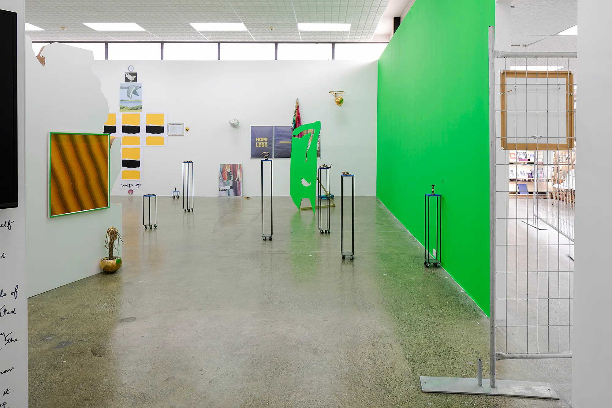
FM: The exhibition handout notes that New Perspectives was “produced in collaboration with Simon Denny”, and I know Adnan and the rest of the Artspace team were also involved. I sort of appreciated the fact that Simon’s presence was quiet. He could have engineered a show that was much more in line with his own concerns. The show does feel in line with other shows at Artspace, in terms of both selection and presentation – though I should mention that I think Hikalu Clarke’s Long range LOS (2016) constructions, both the freestanding cut-outs and those amazing jigsaw-mutilated partitions, take this particular install to a new level, bringing the various works in the show together beautifully.
Adnan’s influence is certainly present. I understand, for instance, that Hannah Valentine originally intended to have a fairly small green backdrop behind the main cluster of her wonderful, portable bronze sculptures, but that Adnan invited her to “go all out”, and so she painted the whole wall, and one of Hikalu’s cut-outs. That to me is the essence of Adnan’s curatorial practice. He gives artists a great deal of latitude and encourages them take risks, which means that many of the shows he is involved in have a kind of bold, urgent quality to them. Or so it seems to me.
Hikalu Clarke and Hannah Valentine, New Perspectives (installation view), Artspace, 2016. Photograph by Sam Hartnett.
LL: I think it’s that quality that lifts this show above other new artist shows. It so hard to forget the politics of the art community, and this show did a really good job of removing them. I’d largely forgotten how useful new artist shows could be. These are works I wouldn’t otherwise have a chance to see. To be able to give a large number of different artists that platform is really special. I think the application process, the open call, helped too. Anyone could apply, and it seems like almost everyone did.
FM: I find it impressive that despite what initially appears to be quite a motley selection – the show includes artists from different backgrounds, with different concerns, working with different media – a real coherence emerges. I don’t know that I could describe what that coherence is exactly. I’m tempted to suggest that the artists are united by a depth of reflection on the social landscape, and a genuine desire to participate in its reshaping. But there’s also a kind of poetry to the whole that – like the best poetry – resists simple explanation.
I really appreciate the fact that the show itself doesn’t try to make grand statements about what it means as a whole. As you’ve suggested, its primary function is to provide a platform for lesser-known artists. The show feels refreshing. It feels brave. It dares to include artists who haven’t yet made a mark, artists who might never end up winning the Walters, or appearing in Artforum, or becoming the next Simon Denny. And that’s so important.
Then, too, many of the artists in this show remind us that youth doesn’t necessarily equate to undercooked ideas or a lack of quality in execution. They prove that you don’t need to have been out of art school for ten years to make work that is amazing and that says things that are important. And that’s very encouraging.
Artspace
23 September to 29 October 2016
Free admissionPartipating artists: Louisa Afoa, Diva Blair, Quishile Charan, Hikalu Clarke, Owen Connors, Charlotte Drayton, Matilda Fraser, Motoko Kikkawa, Louise Lever, Theo Macdonald, Huni Mancini, Tiger Murdoch, Dominique Nicolau/nico, Aroha Novak, George Rump, Mark Schroder, Anna Sisson, Hannah Valentine, Tim Wagg, Faith Wilson, Yllwbro.