Descanting the Domiciliary: A Review of Homeshow, 90 Canon
What if spaces designed for living in were given over to art?
What if spaces designed for living in were given over to art?
In January of 2016, Louise Palmer staged an exhibition in her condemned 1970s modernist home at 90 Canon Street, Edgeware, Christchurch. A few months later the house was demolished. Palmer has described the show as a ‘sculptural deconstruction’ of her late home, where sections of the floor were cut out to approximate the footprints of the furniture that had previously occupied the space. For Palmer, it was an act of subtraction, after all the furniture had been removed, creating a residual presence. It was an opportunity not often conceded – to intervene so directly and irrevocably into the architecture of the house in the service of sculpture – and I imagine that this intervention brought a measured level of catharsis for Palmer.
A second exhibition, Homeshow, 90 Canon, was held at Palmer’s home from the 24th to the 26th of November 2017, with the opening occurring on the evening of Thursday the 23rd. In the exhibition catalogue, Palmer notes that this was almost a year to the day that she moved into her new house, built on the same site to replace the demolished one. Curated by Palmer herself, Homeshow, 90 Canon featured fourteen artists from Christchurch (including Palmer herself), around New Zealand, and overseas. Most of the artists either attended the Ilam School of Fine Arts or had some association with it (UK-based Benedict Drew undertook a residency there and Auckland-based Christina Read exhibited at Ilam at the conclusion of her year as the Olivia Spencer Bower Art Award recipient), the exceptions being Australian artists David Haines and Joyce Hinterding.
The premise of the show, as a continuation of the first project involving the 90 Canon Street address, was to present “the home as a structure and support for displaying and viewing art…” and to “address the domestic context of the home and set up relationships between artworks that relate to personal spaces, sites and architecture.” Having removed practically all the furniture from her home, Palmer’s house became a site that was at once living quarters and ad hoc exhibition space – allowing her to present artworks in a genuine domestic setting with the perceived intention of experimenting with how the works would operate in relation to this.
The work had the dynamism of a constructivist painting but in exuberant pastels of blue, pink, yellow and ochre instead of red, white and black
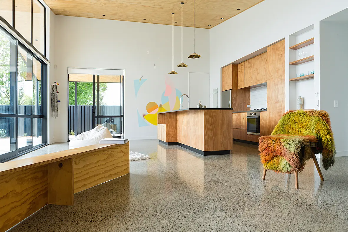
Walking through the gate and over the distinctive Halswell Quarry stone pavers, the street-facing facade of the house, fully glazed from floor to ceiling with ranch sliders and windows, greets the visitor to Palmer’s home. The roofline extends out to a modern interpretation of a portico, sheltering the way around to the entrance where, stepping inside, one was immediately greeted with artworks. The living area was flooded with natural light and to the left of the entrance lies the kitchen where, painted directly onto the largest area of blank white wall in the space was Miranda Parkes’ Sunjunkie (2017). Of all the works in the show, Parkes’ painting was the one which imposed itself most directly onto the house’s structure. Circles, semicircles and triangles appeared to revolve out from a centre point marked with a splodge of gold spray paint. The work had the dynamism of a constructivist painting but in exuberant pastels of blue, pink, yellow and ochre instead of red, white and black. There was an observable connection between this work and those on show in Parkes’ recent exhibition at The Hocken in Dunedin, for which she also painted directly onto the walls of the gallery, utilising a similar palette to Sunjunkie. It would be interesting to learn of this painting’s fate – will it remain a permanent feature in Palmer’s kitchen, or will it be removed, documented only in photographs?
Miranda Parkes, Sunjunkie (2017). Acrylic paint and self-levelling medium on existing kitchen wall.
Annie Mackenzie, Jess (2017). Linen & cotton.
Also in the kitchen, Dave Marshall and Annie Mackenzie’s works found a familiar setting. Mackenzie’s handwoven Jess and Sam (both 2017) are presented as scrupulous counterfeits, hand-woven imitations of designs of mass-produced tea towels and dishcloths. The works’ titles presumably alluded to the names given to the designs by the companies that manufacture them en masse. Mackenzie’s tea towel had been hung on the wall, its bottom edge left unwoven and the separated threads twisted together to form loose plaits. The dishcloth lay flat on the benchtop surface, the light teal of the thread in its pattern echoing elements of Sunjunkie. On the opposite end of the bench sat Marshall’s Pauatahanui Teapot (2017) with a teacup. Marshall was the 2016 potter in residence at the Wellington Potters’ Association, researching the practices of Bernard Leach and Shoji Hamada. His practice takes inspiration from the Mingei movement that these two practitioners were proponents of and exported to Aotearoa by way of notable potter Len Castle. Sourcing clay from the local Wellington area, Marshall’s works were humble in execution, containing a bluish tinge to them, perhaps a feature of the particular clay deposit used in their creation. Through his research, Marshall no doubt has familiarised himself with the Japanese aesthetic of wabi-sabi, whose key elements are readily applicable to his pottery: simplicity, truth to materials, austerity and an appreciation of the handmade and unadorned. Working in collaboration, Mackenzie and Marshall have shown in a number of spaces throughout Aotearoa in the past several years and have both recently had solo shows at Enjoy Public Art Gallery. Their attunement to their respective crafts makes them sophisticated collaborators and authentic individual practitioners.
In light of the recent developments in Palmer’s domestic circumstances – the demolition and rebuilding of her home – these objects appeared to wear the events of her recent history within their forms
Above Marshall’s Horokiwi Anagama Vase (2017) on the kitchen shelves, Palmer’s works Paired Objects, Glasses (2017) were displayed. These were a set of two pairs of blue glass tumblers and on the shelf above, a pair of stemmed glasses. All of the glassware had been affixed together in various configurations. One pair of tumblers were adhered together at their rims, as if fused by an extreme heat. The other pair were broken and an attempt made to piece them back together, as was true for the pair of stemmed glasses. The immediate impulse was to read these objects as a response to the earthquakes, and this may have been Palmer’s intention. However, the fusing of the glasses suggested acknowledgement of a wider scope of natural forces. In light of the recent developments in Palmer’s domestic circumstances – the demolition and rebuilding of her home – these objects appeared to wear the events of her recent history within their forms.
Miranda Parkes, Sunjunkie (2017). Acrylic paint and self-levelling medium on existing kitchen wall.
Annie Mackenzie, Jess (2017). Linen & cotton.
Tim Middleton, soft furnishing (2017). Plaster, polystyrene, filler, wood, felt.
Erica van Zon, Chinese Desert Lines (2012). Hand hooked wool. Courtesy of the artist and Melanie Roger Gallery, Auckland.
David Marshall, Pauatahanui Teapot and Horokiwi Anagama Vase (both 2017). Teacups (2015-2016). Wood fired pottery.
Louise Palmer, Paired objects, glasses (2017). Glass, adhesive.
Further along from the kitchen shelves, in a dark stained wood shelving unit, was Becky Richards’ Thought-tools for the Home (2017). On every one of the shelves were placed objects of materials listed by the artist as: raw and fired clays, stoneware, porcelain, terracotta, volcanic soil, sand, succulents, water, glaze, pebble, cotton thread, gum tree bark, eucalyptus oil, felt, cement. Like the result of an archeological dig, the arrangement read as a wunderkammer of Neolithic tools and crafts, instruments, fetishes, fertility symbols and loose molars. Of note were the hikaru dorodango, a revived Japanese folk craft of creating spheres out of mud and clay that has formed a major strand of Richards’ practice of late, as it was the focus of her solo show at the Blue Oyster Art Project Space in April of last year. The dorodango also spoke of Richards’ concern for the Japanese aesthetic of the handmade and unpretentious, finding its cognate with Marshall’s ceramics.
Like the result of an archeological dig, the arrangement read as a wunderkammer of Neolithic tools and crafts, instruments, fetishes, fertility symbols and loose molars
Facing opposite Benedict Drew’s psychedelic video work, Mainland Rock (2014) was Robert Hood’s Donald’s Pew (2016), which functioned as a place to sit and view Drew’s work. As with two other works in the exhibition (such as Palmer’s Living: Unit 1 and 2, plywood objects which presumably only ‘stood in’ as art pieces for the duration of the show, returning to their utilitarian use at its conclusion), Donald’s Pew inhabits an ambiguous position as both artwork and furniture. It has featured in two recent shows: Feeling Nature, Feeling Free at Jonathan Smart Gallery in 2016, and Contemporary Christchurch later that same year. In both these shows it also served as a place to sit and contemplate the other works. It is one of Hood’s works that, through repeated outings, I anticipate will become cherished through familiarity to Christchurch art audiences. ‘Donald’ is of course, Donald Judd, the American minimalist and it is one of a number of references Hood makes to 20th century modernism in his work. Judd started working with plywood in the late 1970s, producing boxes in series or as singular works, often with segments of plywood set inside them at different angles, apportioning the interior space in interesting ways. Hood’s work is faithful to Judd, utilising these same angles as the main supporting structure of the pew. The shallow obtuse angle also happens to mirror the roofline of Palmer’s house, and the plywood sympathised with many of the surfaces in the living area, including the ceiling. Hood’s work is known for its wryness, and Donald’s Pew cajoled the viewer into wondering, who is Donald? And why does Hood have his pew? In light of the US president incumbent, the name Donald has taken on inescapable associations.
Emma Fitts, Unknown Cloak (2017). Dyed wool.
Rebecca Richards, Thought-tools for the Home (2017). Raw and fired clays, stoneware, porcelain, terracotta, volcanic soil, garden soil, sand, succulents, water, glaze, pebble, cotton thread, gum tree bark, eucalyptus oil, felt, cement.
Louise Palmer, Living: Unit 1 (2017). Plywood, polyurethane.
Benedict Drew, Mainland Rock (2014). Video. Courtesy of the artist and Matt’s Gallery, London.
Robert Hood, Donald’s Pew (2016). Radiata pine plywood. Courtesy of the artist and Jonathan Smart Gallery, Christchurch.
Affixed to the glass of a ranch slider was Joyce Hinterding’s graphite drawing, Canon House Oscillator (2017). Over the summer of 2017, Hinterding had a major survey show, Energies at the Christchurch Art Gallery Te Puna o Waiwhetu alongside her regular artistic collaborator, David Haines. In Energies, Hinterding exhibited a number of graphite works that were connected to amplifiers and headphones that allowed visitors to listen to the energies contained within them and the surrounding environment. In Homeshow, 90 Canon, Hinterding’s drawing was installed without piezoelectric sensors, nor the means to listen to the energy contained within it. Resembling a medieval labyrinth pattern with the bottom third warped and distorted, the work existed as a potentiality, the mathematical patterning becoming a roadmap to the energies lying dormant within the work. The esoteric pattern resonated with Annie Mackenzie’s third work in the show, Rosa (2017), a hand-woven wool scarf hanging just by the entrance on a coat hook, its curious pattern evocative of sine waves on an oscilloscope, or old CRT TV static.
Could Fitts have intended this cloak to belong to an anonymous nomad?
And if so, what was their fate?
Two more textile works were present in the living area: Erica van Zon’s Chinese Desert Lines (2012) and Emma Fitts’s Unknown Cloak (2017). Next to Tim Middleton’s Soft Furnishing (2017) – a tongue-in-cheek title for an immense plaster cast of a beanbag – van Zon’s work was a hand-hooked wool rug with a tessellated pattern of white and grey that mirrored the paved pathway that could be seen through the window. The work received the Jury award at the 2012 Wallace Arts Trust Awards and was part of the group show WWWII: Julian Dashper and Girlfriends staged at GLOVEBOX in Auckland early last year, where it was displayed on the wall. I found it interesting to compare the ways the work was shown in both contexts: Palmer placed it on the floor of the space, against the mottled grey concrete of the living area. The title and patterning on the work make reference to mysterious lines that were discovered on Google maps in China’s Gobi Desert back in 2011. The lines were the cause of much speculation and conspiracy theory, one source even surmising that they were calibration targets for China’s spy satellites. Van Zon took these patterns and turned them into a formalist abstraction on her rug. Nearby, Fitts’ Unknown Cloak, made of dyed wool, was draped over a chair. I was reminded of an exhibition I attended in January of last year at Audio Foundation, of works from Auckland-based artist Andrew McLeod following his 2016 expedition to the South Siberian Republic of Tuva. In the show, he had displayed a coat of wool that had been ‘cured’ with milk. Fitts’ cloak had a similar nomadic quality to it. The ‘unknown’ of the work’s title gave the cloak a layer of mystery, as often Fitts names her work after a person it was inspired by or intended for (Bomber Jacket for Marilyn Waring (2014), for example). Could Fitts have intended this cloak to belong to an anonymous nomad? And if so, what was their fate?
Emptied of any other furnishings typical of a bedroom however, this did not feel like a private intrusion, rather the objects provided cues as to how to live more genuinely
Christina Read, Quilt for My Bed (2017). Fabric quilt.
Moving through to the bedroom, Christina Read’s Quilt for My Bed (2017) was shown alongside David Haines’ Time Machine 02 (2016). Read’s work was made during her year as the Olivia Spencer Bower Foundation Art Award recipient and was first exhibited at the Ilam Campus School of Fine Arts Gallery in her show Here’s a Plan (things to do) early last year, where it was displayed neatly folded and placed within a Perspex box. In Homeshow, 90 Canon, it was draped instead over an upended bed frame, allowing the viewer to appreciate the skill involved in the quilts creation, where strips and blocks of solid colour ranging from deep blues and greens, to pastel pinks, light greys and the occasional red and yellow floated on largely a white background. Read has noted that her focus was on the making of the object and during the Ilam show the quilt existed as a potentiality. Here however, it was unveiled to its full extent, proudly showing its maker’s respect for quality and attention to detail. Haines’ work comprised a small bottle of perfume sitting on shelf jutting out from the wall alongside two framed ultrachrome pigment prints. The print on the right was plain white, while the one on the left was black, displaying the name of the scent and the ingredients of the bottle in white text: the eau de cologne ‘Vallee des Fleurs’ which Haines had modified with aroma molecules. ‘Vallee des Fleurs’ is a discontinued fragrance by Jean Guinamand, which Haines had renamed ‘Dark Woods Maritime Signals’, creating a new perfume through his additions. Paired with Read’s quilt, there was a heightened sense of the intimacy of a private domestic sleeping space as a lingering scent remained from previous visitors spraying the perfume. Emptied of any other furnishings typical of a bedroom however, this did not feel like a private intrusion, rather the objects provided cues as to how to live more genuinely.
Perhaps the answers Read was seeking were the selfsame as what The Orange Theory was attempting to solve, or vice versa
In the final area of the exhibition, the study, Read’s video work Books I’d like to Read (2005) played on a screen sitting atop Palmer’s Study: Unit 1 and 2 (2017), alongside which stood Paul Cullen’s The Orange Theory (2007). Both Read and Cullen’s pieces were older works from last decade. Books I’d like to Read featured a scrolling text – like the credits at the end of a film – listing the titles of books she had wanted to read at the time of making, set to a soundtrack of Mozart’s Fifth Symphony. Cullen’s work was a white wooden chair, lit underneath by a lamp. The seat of the chair had a section cut out of it and in the gap remaining, an artificial orange rotated slowly, driven by a small motor attached to the side of the chair. The late Paul Cullen spent time as a furniture maker and held a science degree in addition to studying fine arts at both Ilam and Elam. The work serves an obvious debt to Marcel Duchamp and Dada. Like Duchamp’s Bicycle Wheel, Cullen had rendered the chair non-functional by altering it in a way so it couldn’t be sat on. Instead of a spinning wheel there was a rotating orange. Pataphysics, the science of imaginary solutions, was a current that ran through Cullen’s work. Keeping this in mind, this absurd object may have been proposing an answer to a question that has since been lost to time. The artificial orange could be read as a pataphor – a metaphor twice removed from its original context. While Read’s text scrolled, Cullen’s orange spun, the mechanism an Orrery, or more specifically a Tellurion – a clockwork model of the Earth and the Sun. While Mozart’s symphony played together with the spinning of the orange, Musica Universalis, the harmony of the spheres was called to mind. Read’s work also alluded to the search for answers, perhaps to be found in the books that scrolled past. I noted that one of the books was The Myth of Sisyphus, Albert Camus’ philosophical essay on the absurdity of existence. Perhaps the answers Read was seeking were the selfsame as what The Orange Theory was attempting to solve, or vice versa. In dialogue, despite the endless spinning of the orange and the credits without end, there was a solemn introspection to the two works presented together. To my mind, this was the most successful pairing of objects in the show. Palmer had indeed set up a recognisable and moving conversation between the two works.
Louise Palmer, Study: Unit 1 and 2 (2017). Plywood.
Christina Read, Books I'd Like to Read (2005). Digital video. Courtesy of the artist and Circuit Artist Film and Video Aotearoa New Zealand.
Paul Cullen, The Orange Theory (2007). Chair, artificial orange, aluminium foil, cable ties, rubber band, electric light and cord, electric motor and cord. Courtesy of The Paul Cullen Archive.
Homeshow, 90 Canon was an object-focused show that attempted to prompt discussions around domesticity and how artworks could respond to this particular setting. Opening her home to guests and strangers to view work in her own domestic context was an act of generosity and good faith. Perhaps this was an essential part of Palmer’s coming to terms with her new living situation, a year on from its disruption as a result of the demolition of her previous home due to damage sustained in the Canterbury earthquakes. The concept of showing art in houses post-quakes is not without precedent – one of the show’s artists, Tim Middleton ran a gallery out of his home at 183 Milton Street in Sydenham, responding to lack of exhibition space immediately following the events. North Projects artist-run space was also located in an ex-habitable half of an old villa and several artists that showed there made a decision to respond to this context. Offering these spaces to the art community in Christchurch implies that those like Louise, who relinquish their personal spaces for exhibiting artists, are motivated by retaining the momentum for showing at this scale that functions apart from the commercial and public galleries, and where in a recovering city, suitable space has been left wanting. Palmer has expressed her intention to continue to realise projects in her home. I await the next iteration to discover if the themes in Homeshow, 90 Canon will be extended or if a new direction for the concept is undertaken.
Photographs by Sarah Palmer.