Ballard, Sheffield, and Waiting to Die
"All of us have our dreams to reassure us. Architecture is a stage set where we need to be at ease in order to perform. Fearing ourselves, we need our illusions to protect us, even if the protection takes the form of finials and cartouches, corinthian columns and acanthus leaves. Modernism lacked mystery and emotion, was a little too frank about the limits of human nature and never prepared us for our eventual end."
Blame Hugh’s quotesmanship. That’s J.G Ballard’s considered, if wistful, eulogy to modernism in the Guardian, from 2006. There’s a man whose integration/disintegration of humanity into an inexorably urbanising environment stands totemic in its influence on art, music and film. If you’re looking for something to do this afternoon, go read this (it has one of my favourite/funniest opening lines ever) and leave this spinning.
It’s good for a wallow, is a High Rise and Unknown Pleasures one-two. But to wallow is to indulge, rather than get perspective. So after you’ve immersed yourself in their spiralling decay, I reckon you should do what I did and go back to Ballard’s Guardian piece. It’s easy to skim his influence (like I did, initially) and think he loathes the oppressive, centralised designs of post-war Europe.
"…modernism was a breath of fresh air and possibility. Housing schemes, factories and office blocks designed by modernist architects were clear-headed and geometric, suggesting clean and unembellished lives for the people inside them. Gone were suburban pretension, mock-Tudor beams and columned porticos disguising modest front doors."
There’s a bludgeoning honesty, then, that he’s suggesting the past two centuries recoiled from. The Victorian age revelled in those trimmings in his quote. It harked back to the medieval gothic, the Renaissance, and the strict social hierarchies that classical plinths and columns demarcated. It was a cultural tourist, borrowing from the Egyptians and the Orient with aplomb (you can still get a wonderful kick of that now inside the Auckland Civic and its accompanying environs - opium den decadence jostles with minarets ringfence stoic British lions). But the Victorian age also held as much squalor, as much scarcity, as much sickness as ours. These things are always there. But what the past’s stately pastiche concealed, Modernism indifferently put on show.
And that can be a punishing thing to see in tough times. Sometimes, you’d like to conceal it again.
"We begin, as one should, in Castle Market. This is a complex, multi-level structure built into a slope in the depressed north of the city centre, where the poorer Sheffielders go to buy everyday whatnot and enjoy a cup of tea or several in its excellent grease-caffs. It’s one of the earliest, and most ambitious attempts at pedestrian planning in the UK, both cavernous at its depths and fearlessly open at the top, in the walkways you can see being used unassumingly by the clientele of Cafe Internationale.
…
Sheffield’s Lib Dem City Council got wind of a proposal to English Heritage to list the structure, immediately loudly made their opposition known, and have tried to start a letter-writing campaign. Most things about the possible listing on the internet are besmirched with dozens of comments along the lines of ‘its ful of chavs drop a nukleer bom on it lol’, which makes clear what’s really at stake. The Castlegate area of the city is where working class people come to shop, meet people, hang around. It’s been left to rot for over two decades without serious maintenance, and the council have a lot of money riding on the prospect of building a crap simulacrum of Leeds here - when the nearby Castle House, a building with incredibly expensive materials and built-in artworks, got listed, they appealed (and lost). They want this place, and these people, out.
Unfortunately this place, and those people, are what make Sheffield different from Leeds, or Manchester, or Birmingham - it has a city centre which can still accommodate those who are elderly, or poor, or (from the looks of it, often) ill. It’s a unique survival, architecturally and socially, which needs decent upkeep and little else - it’s well-used, even on a miserable Monday morning. However, when Sheffield’s civic fathers decide one of the modernist monuments left by their socialist forerunners might as well be preserved, they can’t just let it be. Not only the people in it, but the fabric of the building itself has to be stripped out.
(from Owen Hatherley’s blog, August 2010)
There’s an air of the pseud we risk getting from High Rise and other depictions of urban decay, as well as the promise of urban renewal as seen in an endless succession of 3D blueprints and newspaper spreads. And that’s not wrong or evil - greenery and open space and fresh air are all good things. We should be able to enjoy more of them in our daily lives. What does make me step back and question myself is the thought that it’s these massive housing projects that are the problem somehow - they they’re to blame because they rather pitilessly show the functional, hand-to-mouth lives of their residents. It’s a grim, daily reality that’s framed by the graffitied walls of explicitly economical housing rather than faux-marble trappings. Of course it makes us uncomfortable.
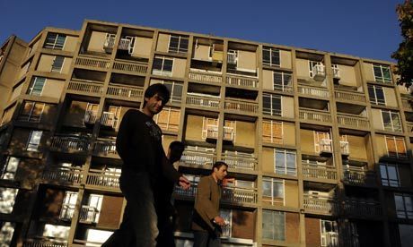
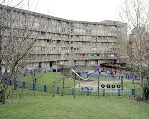
And we lose sight of the noble aims involved. As Hatherley points out, Sheffield’s Park Hill Estate (also soon to become a target of ‘urban renewal’) was a virtuous civic project. It cleared out a tightly-packed, violent slum near the city’s main train station and gave its impoverished inhabitants shelter, warmth and space for the first time. Far from thoughtless and alienating, it attempted to recreate a tight-knit community through an array of elevated connection and varying heights. Of course it didn’t look like fucking Notting Hill - but it set out to create something for those who had nothing.
To denigrate these places as they lose what little sheen they had plays into the hands of a new, much crueller age. When we lament the perceived squalor of something like Park Hill, we have these idealised visions of something like what we have, with its comparative comfort and stylishness, taking its place. Of all those people (never mind their unemployment, their poor standard of education, nutrition and health) being changed for the better by inspiring and sleek new surroundings. Sheffield’s city council has demolished thousands of council flats over the past decade, as queues of people facing transient, unstable lives line up for what remains. What for? “Housing market renewal”.
Suddenly, I’m looking at these great European hulks anew - they never really changed, and so it can’t be said they left generations of people on the heap. And then it hits home that High Rise wasn’t really about the banality of civic housing. It’s about the banality of human evil.
“One woman was bewildered by our presence and asked us why were taking photos of here. She’s clearly lost any confidence in her value and therefore in that of her surroundings. She’s been told she’s worthless so many times, she has come to believe it. And therefore where she lives is crap too…For me, this valley makes me question the potential for architecture to be able to design away problems and make everyone’s life better by design because it’s not simply beautiful, it’s stunningly beautiful. And although the building is only to 1950s standards, it is well designed. Yet the statistics on unemployment, crime, teenage pregnancy and exam results are some of - if not the - worst in Sheffield. The roots of this valley’s problems are education and unemployment and the dissolution of a society’s values where everything is evaluated by a bottom line, be it on a spreadsheet or a celebrity.”
From The Sesiquipedalist.


